Drakota: A Sans Serif Typeface That Breathes With Your Content
Last Tuesday, I sat down to refresh the cover of a seasonal recipe ebook—something warm and unhurried, full of oatmeal cookies, slow-simmered stews, and handwritten grocery lists. The old cover font felt stiff, like it was holding its breath. I needed something that could carry quiet confidence—not loud, not trendy, but present. That’s when I opened Drakota.
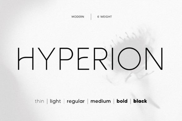
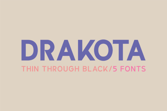
Drakota is a contemporary sans serif typeface with five distinct weights: Thin, Light, Regular, Medium, and Black. It doesn’t shout. Instead, it settles into the page like natural light—clear, even, and gently intentional. There’s a subtle warmth in its curves, a softness at the terminals that avoids cold minimalism without slipping into whimsy. Its rhythm feels generous: open counters, balanced spacing, and just enough contrast between thick and thin strokes to guide the eye without demanding attention.
I started with the cover title in Drakota Black—bold enough to anchor the layout, but never aggressive. Then I dropped the subtitle into Regular, letting the two weights converse like voice and whisper. The result wasn’t “designed”—it felt arranged, as if the words had found their own place.
What makes Drakota especially thoughtful for editorial work is how gracefully it scales. In a digital magazine layout, I used Light for pull quotes—delicate but legible against soft background textures. For chapter openers in a coaching workbook, Medium offered quiet authority without heaviness. And in a printable wedding guide, Thin became an elegant divider line beneath section headers—almost calligraphic in its restraint.
It’s not built for long-form body text—and that’s part of its strength. Drakota shines where intention matters most: titles, covers, headers, navigation labels, and moments of emphasis. Its clean geometry holds up beautifully on screens, from mobile newsletters to PDF course handouts. On retina displays, the Thin and Light weights retain clarity; on printed planners, the Black weight adds tactile presence without ink spread.
For real-world consistency, I paired Drakota with a warm, readable serif for body copy—think a well-spaced Garamond or a relaxed Lora. The contrast works because Drakota doesn’t compete; it frames. Its sans serif nature creates breathing room, while the serif grounds the reader in familiarity and flow. For captions or sidebar notes, I sometimes used Drakota Light alongside a monospace accent font—just enough texture to signal function without clutter.
In a lifestyle blog redesign, I applied Drakota across three key touchpoints: the site header (Black), article titles (Medium), and newsletter graphics (Thin + Regular combo). Each use reinforced the same feeling—calm competence. Readers didn’t notice the font, exactly—but they lingered longer on headlines, scrolled more smoothly through features, and told me the tone “felt like coming home.” That’s not magic. It’s typography doing its quiet work.
Drakota also behaves thoughtfully across formats. When exporting a course PDF, all five weights embedded cleanly—no fallback surprises. For social media graphics, the Black weight held up in small thumbnails; the Thin weight added elegance to Instagram quote cards without pixelation. And because it includes standard OpenType features—ligatures, small caps, and localized glyphs—it supports multilingual content with grace, whether you’re designing a bilingual printable planner or a global newsletter.
Before using Drakota in client-facing or commercial work, I always check the license. It’s a premium font, and its commercial license covers ebooks, templates, printables, paid newsletters, and digital downloads—so no last-minute licensing hiccups when launching a new product suite. The files come in both OTF and WOFF2, making it equally at home in Figma layouts and live web builds.
One afternoon, I tested Drakota Regular in a 14pt size across three devices: an iPad Pro, a mid-range Android phone, and a matte-finish printed worksheet. On screen, the letterforms remained crisp—even at smaller sizes in email footers. In print, the ink settled evenly, with no blurring in fine strokes. That kind of reliability matters when your audience is reading on a kitchen counter at 7 a.m. or skimming a coaching tip between meetings.
What stays with me isn’t just how Drakota looks—but how it moves through content. It doesn’t interrupt. It doesn’t distract. It gives structure without rigidity, elegance without effort. In a recipe ebook, it lets the ingredients speak first. In a wedding guide, it honors the emotion without overshadowing it. In a digital magazine, it creates pause—just long enough for the reader to lean in.
If you’ve ever spent too long choosing a font for a newsletter header—or hesitated over whether a title feels “true” to the story beneath it—you’ll recognize this: Drakota doesn’t solve design problems with force. It solves them with alignment. It matches the care you put into your words, your images, your ideas—and returns that care in visual form.
Typography, at its best, is hospitality. It welcomes the reader, guides their attention, and honors their time. Drakota does that quietly, consistently, and with unmistakable grace. Not as decoration—but as dialogue.
- Use Drakota Black for covers, logos, and bold headers
- Choose Medium or Regular for article titles and section headings
- Try Light or Thin for pull quotes, captions, and delicate accents
- Pair with a warm serif for long-form body text
- Verify commercial licensing before distributing templates or paid digital products