Kordune: A Modern Sans Serif Font for Digital Design
As a UI designer who ships dozens of landing pages, SaaS dashboards, and e-commerce experiences each year, I treat typography like infrastructure—not decoration. It shapes how users scan, trust, and act. That’s why Kordune stands out in my font library: it’s a thoughtfully crafted sans serif font built for clarity, rhythm, and brand cohesion across every digital touchpoint.
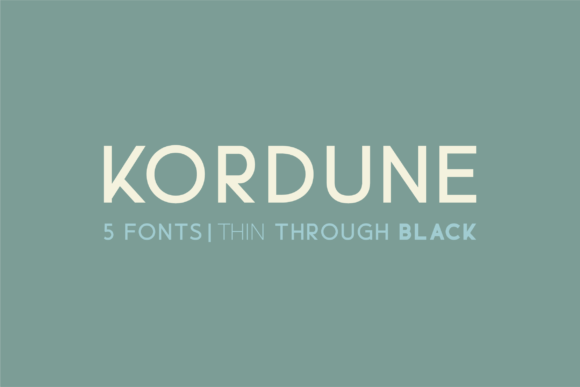
Kordune isn’t just another minimalist typeface. Its five distinct weights—Thin, Light, Regular, Medium, and Black—give you precise control over visual hierarchy without switching families. The letterforms balance geometric precision with subtle humanist warmth: open apertures improve legibility at small sizes, generous x-heights support readability on mobile screens, and consistent stroke contrast ensures clean rendering across browsers and devices. It feels contemporary but never cold—ideal for brands that want to signal innovation while retaining approachability.
In practice, Kordune excels where digital design demands both function and tone. Use the Black weight for hero section headlines—it commands attention without shouting. Pair Regular or Medium with tight line-heights for navigation bars and product cards, where scannability matters more than flourish. The Thin and Light weights shine in subtle contexts: caption labels, form placeholders, or footer text—especially against light backgrounds or soft image overlays. On dark mode interfaces, Kordune’s even ink distribution prevents haloing and maintains crispness without added CSS tricks.
For conversion-focused layouts, Kordune delivers consistency where it counts. A boutique online store might use Black for banner headlines (“Handcrafted Ceramics, Shipped Free”), Medium for product names, and Regular for short descriptions—all within one family. No cognitive friction. No mismatched spacing. Just intentional progression. On course sales pages, I often set CTA buttons in Medium with all-caps styling and modest tracking—clean, confident, and accessible. And because Kordune includes true italics and well-hinted webfont files (WOFF2, WOFF), it performs reliably in responsive templates, email clients, and CMS-driven blogs.
Brand identity benefits most when typography behaves predictably across mediums. Kordune supports multilingual Latin-based languages—including extended diacritics for French, Spanish, German, and Scandinavian use—so your international landing pages retain typographic integrity. Its OpenType features include standard ligatures and discretionary alternates, useful for logo lockups or branded social media graphics where a single wordmark needs refined spacing or character distinction. It’s not a script font or decorative display font; it’s the dependable backbone—the premium font that lets your content lead, not your type choices.
Font pairing is where Kordune reveals its versatility. As a sans serif font, it pairs naturally with a restrained serif font—think Merriweather or Cormorant Garamond—for editorial blog layouts or long-form course modules. The contrast creates breathing room and signals content depth. For app interfaces or dashboard UIs, pair Kordune with itself: use Thin for disabled states, Regular for body copy, and Black for active tabs. That kind of internal harmony reduces design debt and speeds up developer handoff.
On mobile, Kordune’s responsiveness is built-in—not bolted on. At 14–16px, Regular remains highly legible even on low-DPI screens. For buttons under 40px tall, I default to Medium with 0.5px letter-spacing—no blurring, no fallbacks. When overlaid on photography, its neutral gray tones hold up against both warm and cool backgrounds, especially when adjusted with modest CSS opacity or backdrop-filter effects. And unlike some modern typefaces that collapse at small sizes, Kordune’s counters stay open, preserving character recognition during quick vertical scrolling.
Real-world examples? A creative portfolio site uses Black for project titles and Light for client names—creating instant context without icons or color cues. A wellness coaching brand deploys Medium for section headers (“Your 3-Step Journey”) and Regular for benefit bullets—calm, grounded, trustworthy. An indie SaaS tool opts for Regular across all UI text and reserves Black exclusively for feature highlights in onboarding modals—guiding attention without overwhelming.
Before implementation, always verify licensing. Kordune is a commercial font, meaning usage rights vary by deployment method: self-hosted webfonts require a web license, while desktop use for mockups or Figma files may fall under a separate plan. If you’re building templates for clients or selling digital products (like Notion kits or Shopify themes), confirm whether your license covers redistribution. Most reputable foundries offer clear tiered plans—web-only, desktop + web, or extended for apps and eBooks. Never assume “free download” means free for production use.
Kordune doesn’t try to be everything. It’s not a handwritten font for whimsy, nor a bold display font for posters alone. It’s a focused, capable typeface engineered for the constraints and opportunities of digital space: fast loading, high readability, cross-browser fidelity, and expressive range within a single family. When your brand lives online—whether in a checkout flow, a webinar slide, or a micro-interaction—the right sans serif font quietly reinforces credibility, guides decisions, and holds your visual language together. Kordune does that work, consistently, without fanfare.
- Use Black for hero headlines, CTAs, and logo text
- Choose Medium for section headers, product names, and interactive elements
- Apply Regular for body copy, form fields, and UI labels
- Reserve Light and Thin for captions, footers, and secondary metadata
- Always test contrast ratios—especially on dark backgrounds and image overlays